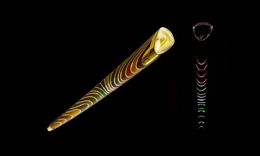
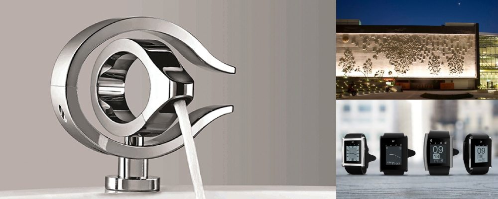
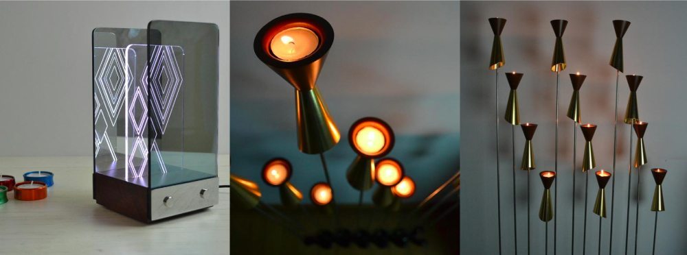
One of India’s leading product and space designers, 44-year-old Michael Foley is considered a trendsetter in Indian design — he was the one chosen to create the iconic Commonwealth Games baton in 2010.
After graduating from the National Institute of Design, Ahmedabad, in 1994, Foley joined Titan Industries as a product designer and, within a decade, he had risen to the top of the Titan Design Studio and become chief creative advisor to Titan Industries. At Titan, Foley built iconic brands like Titan Edge, Fastrack, and Xylys — setting the aesthetic and design standards the company would continue to follow even after he had left to create his own studio, Foley Designs, in 2006.
He has contributed to the design of some of Bengaluru’s contemporary iconic spaces, such as the Kempegowda International Airport and Orion Mall. The studio has also recently launched its own range of ‘smart’ home products under the brand name Tilt.

In this conversation with FactorDaily, we ask Foley about the special relationship between technology and design, and how the two are shaping our world.
Q. Technology and product design are more intrinsically linked today than perhaps ever before. How are the two interacting with each other?
A. Probably the first set of things that are actually getting addressed by this are utilitarian. What does technology bring to design, convenience, analytics… we are going beyond just information collection. For instance, the health space is probably the biggest where technology has enhanced processes. From very low hanging fruit like simple data collection to interpreting that to working through geographies, it’s opened up into many streams of applications. In Bangalore, there is a lot of excitement around how to interpret technology and therefore come up with something intuitive as a product. I’d say that it is easy to configure a technology platform at a base level and then build it up into a more engaging experience with the consumer — that’s the part one is seeing a lot of evolution in. Take the wearables space for instance; most of it is platform innovation, based on which people are creating interesting applications. So that’s where we start filling in as designers. We see what we can build from a product perspective.
“In Bangalore, there is a lot of excitement around how to interpret technology and therefore come up with something intuitive as a product.”
Q. Can you give some examples of that?
A. Take fitness trackers, which interpret and analyse base data collected from the body. As there’s more and more refinement of the base data, the product evolves, becomes more accurate, and its design too changes. On the other hand, the general smartwatch space has probably not hit the right threshold in terms of success. We are dealing with snippets of information, and as you scale down from a desktop to a tablet to a phone to a watch, the amount of content becomes abridged down to snippets. And there, at that point, the kind of versatility your device has is very low, given the size of the screen and the applications you can build on a small real estate. The generic smartwatch has reached a plateau. The extent of information that you get is not standalone, is not good enough compared to the other mobile devices that you carry.

Q. So is the smartwatch dead?
A. The attempt in smartwatches has been to bring a lot of utility to the device… watches generally have become more about accessorising and style rather than functionality. Finally, today time is on every device. So while the smartwatch has attempted well to bring back greater utility, if you are forced to choose between a watch and a mobile phone you’d probably still carry your phone rather than your watch. There the smart technology has not been able to embed enough balance of utility and style. Maybe it has reached a point where it will see a transformation of some kind. If you link ‘smart’ with a category — say smart and fashion, smart and health, smart and education, that’s where you start seeing a lot of innovation in design, driven by technology.
“The generic smartwatch has reached a plateau. The extent of information that you get is not standalone, is not good enough compared to the other mobile devices that you carry.”
Q. How has the smartphone screen evolved?
A. In tablets and phones, the simplicity of navigation is probably the biggest innovation… I mean, a child can get on to YouTube and find their specific content very very easily now. There is a certain amount of broad simplicity that leads to a lot more intuitive experience on the device. But apart from that, each brand is trying to build an ownable identity and holding on to a certain set of things, even though the product keeps evolving from one generation to the next to the next. That signature innovation and experience is something they want as a hook for the consumer not to move away from their product. They don’t want consumers to have to learn too much to get on to a device. That’s probably the biggest drive for design innovation here — to make it extremely easy to get on to a device. Manuals don’t exist today.
That’s probably the biggest drive for design innovation here — to make it extremely easy to get on to a device. Manuals don’t exist today.
Q. Is that leading to uniformity and homogeneity?
A. You do see a lot of uniformity in design today across mobile phones. There’s a lot of commoditisation of some of the features so that the risk of losing a customer because of some innovative way of navigating is lower. Innovation has become a little more incremental versus when the first set of smartphones came out.
Q. You are a fan of Apple’s design values. What do you think of the move to remove the earphone jack from iPhones?
A. The whole wireless space is growing and the future is in the wireless space. Apple has probably taken a bold step to express that. Right now there’s a commoditisation of charging itself. Each brand owns charging specifically to their platform. But that will change the moment charging becomes universal. You will stop carrying the whole paraphernalia of things along with a phone. You can see it in some cafes today… wireless charging accessories in cafe tables. It will also reflect in the way we work… if you look at the way work culture’s changed over time, from cabins to cubicles to working on the move to not having your own desk space, it is linked to how technology embeds itself. We will stop being dependent on where power outlets are. That will get very versatile and open up to a lot of flexibility for devices.

Q. Does design drive technology or does technology drive design? What is the power structure there?
A. At one point, technology leads design because there are innovations that drive changes in design. Say wireless innovations would drive design in a pretty drastic way… so, at the point where technology embeds itself into everyday life, technology drives design. But in its true application with the consumer, design drives technology. You start adapting tech almost like a palette of things you can put together to suit a consumer’s need. Closer to the consumer, design drives technology but if you move it up, away from the consumer, technology drives design. If you look at, say, carbon fibre material, the material innovation has driven a lot of design of products that are extremely lightweight, extremely strong. So a lot of Formula 1 car parts are carbon fibre because it allows you to give the right balance of strength and weight. At the point of using carbon fibre, design plays a bigger role in how you interpret it for aerodynamics and things like that.
“In its true application with the consumer, design drives technology. You start adapting tech almost like a palette of things you can put together to suit a consumer’s need.”
Q. Technology and design — how big is that a part of your own work?
A. The great thing about Bangalore is that there’s a startup culture, so there are a lot of interesting starting points to innovation and technology. They have now realised the value that design can bring to that, and we see a great marriage of design thinking with interesting technologies that help improve convenience and there we as designers have started playing a bigger role. Briefs are not very structured, we get a broad flexible brief — then we drive design. Say companies that are looking at workspace design… can we innovate on lighting in the workspace for example. We can drill down into product ideas versus, say, just designing a table lamp.
Q. Emerging technologies and their intersection with design… we were talking about Virtual Reality, how architects are using VR in their work…
A. These things are definitely happening. VR also lets us build better visualisation tools, to help a client look into your idea or your concept in its most finished state. The earlier you do that, the faster you move to closing a concept. In the old days, or even now, you use sketch and 3D models but with VR, you cut into getting a quicker visualisation very fast. There is an advantage and disadvantage to it. The advantage is it gives you versatility of visualisation — you can see a design in 20 different finishes, so you can can funnel down fast. But it also reduces the chances of failure in some way… see, in the design process we try to fail early enough — so you fail at the sketch stage or the 3D model stage and then refine till you get to a stage where you can actually share the idea. With VR, in some way, it collapses that trial and error process. And maybe I’m a bit old school but I feel that process is important. We need to hold on to something that is tangible at the visualisation stage. If VR is used as a tool right from the beginning, we will lose the whole feel of building something with your hands to a particular scale and I feel that’s something we shouldn’t lose. (At our studio), we use VR for specific applications but we still insist designers sketch and think 3 dimensional by doing it on paper or building models.
We need to hold on to something that is tangible at the visualisation stage. If VR is used as a tool right from the beginning, we will lose the whole feel of building something with your hands
Q. You are a admirer of the Philip Starck, Charles and Ray Eames schools of design-thinking; minimalist and clean. Are we universally moving towards that aesthetic?
A. It is becoming a lot more minimalist in some ways because now you don’t need a product to be shaped to tell you a story… technology is shapeless in some ways. In the old days, a phone had to have a rotary dial or a dial pad… there was a certain way to dial so you had to build it that way. But today technology allows you to press a keypad and tomorrow you have a screen that’s not in a physical/tangible dimension at all. So technology is not influencing shape as much anymore. I think that is changing design expressions. In the analog world, technology was so embedded to shape that the shape itself was driven by technology. Say you look at an old doorbell — the shape itself was designed to create sound. But today, a bell is just an amorphous box. Or a speaker — you can shape it in any way you want. So, the new generation has to hook onto semiotics much more, be more connected to visual cues of products. And that’s making everything very minimalist, simple, almost characterless. Look at the spectacles versus contact lenses — a contact lens is practically invisible, so it has no connect to any kind of shape. And that’s happening in a lot of technology-driven products.
Subscribe to FactorDaily
Our daily brief keeps thousands of readers ahead of the curve. More signals, less noise.
To get more stories like this on email, click here and subscribe to our daily brief.
Lead image: Rajesh Subramaniam/ FactorDaily Other images: foleydesigns.com


